
Nong’s Khao Man Gai Fictional Rebrand
Roles: Illustrations, design, UI/UX, & coding
I am a huge fan of Nong’s Khao Man Gai here in Portland, Oregon. They’re known for their chicken and rice which may seem super simple but some of the best meals are. Aside from the food being amazing (I’ve tried everything on the menu and can confirm it’s all great), Nong herself has put the restaurant on the maps. She famously started out with a food cart in the city and worked her way up. In the process, the brand has taken on many faces and I felt that it could use a little bit of an update to match where they’re at today.
The main logo type choice is meant to reference lettering in the Thai alphabet. Nong herself is from Bangkok and this chicken and rice dish is a famous Thai street food. The illustrations have a hand-drawn feel like some of the previous illustrations they’ve used in the past. The items I chose to include range from some of the spices and herbs that make the dish what it is, to lettering referencing her journey from Bangkok to PDX. Overall, it’s meant be bright, welcoming, and playful.

Brand illustrations

Menu

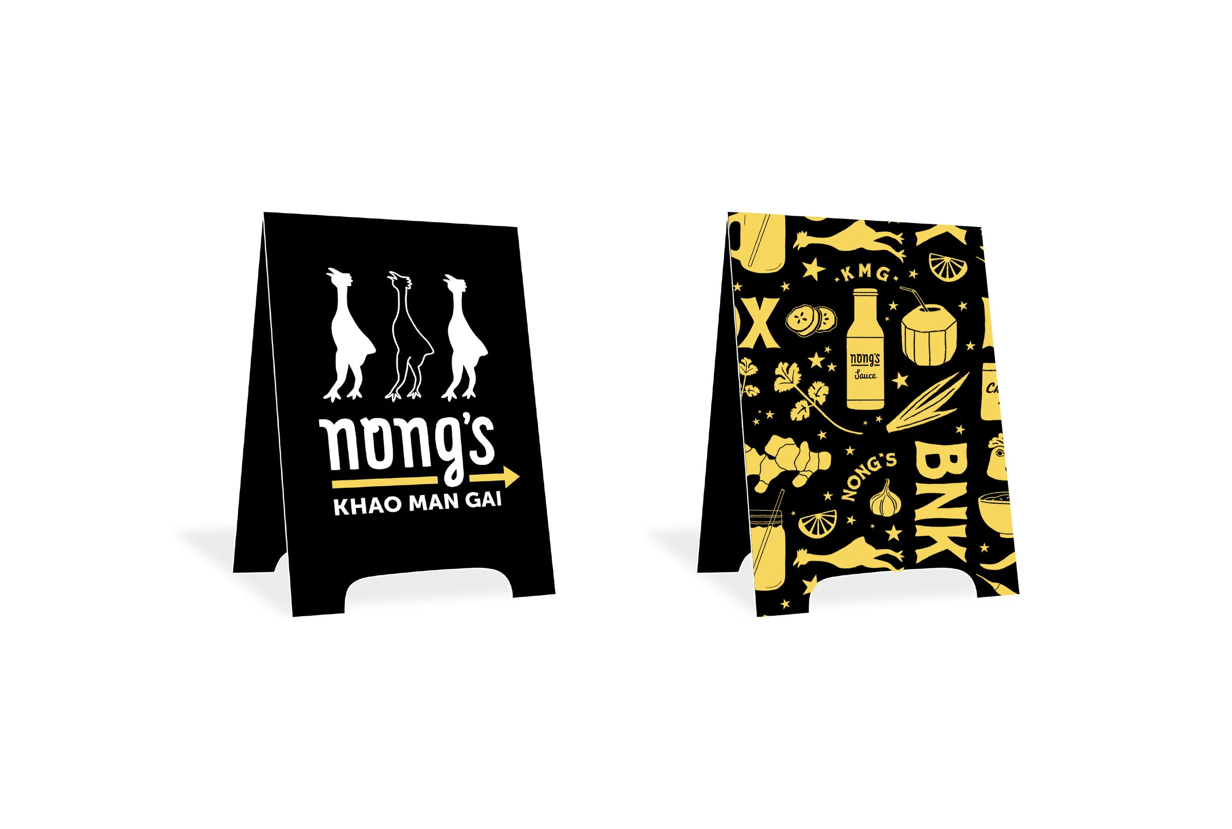
Sandwich board

Stickers